Holo Taco
Product & UI/UX Design, Brand Identity, E-commerce & Web, Packaging
Holo Taco (HT) is a nail polish brand founded by Cristine Rotenberg, creator behind Simply Nailogical, YouTube’s largest nail art channel. As design and UI/UX lead at Cinnamon Toast New Media, I led the end-to-end brand identity, packaging, and mobile-first shopping experience, shaping UX strategy, art direction, and visual systems to create an emotionally engaging, conversion-optimized e-commerce experience designed for high-traffic product drops and rapid launch success in a competitive beauty market.
The brand launched to immediate success: the first collection sold out within 30 minutes and scaled to $22M+ in annual online revenue by 2024, with limited-edition box sets continuing to sell out within hours. By November 2025, holotaco.com generated $1.36M+ in monthly revenue, outperforming key competitors and demonstrating the lasting impact of thoughtful UX, strong visual systems, and high-end packaging. Together, these elements have positioned Holo Taco as a standout brand in an extremely competitive beauty market while building long-term brand equity.
Visit site
Credits: Designed in-house at Cinnamon Toast New Media Inc.
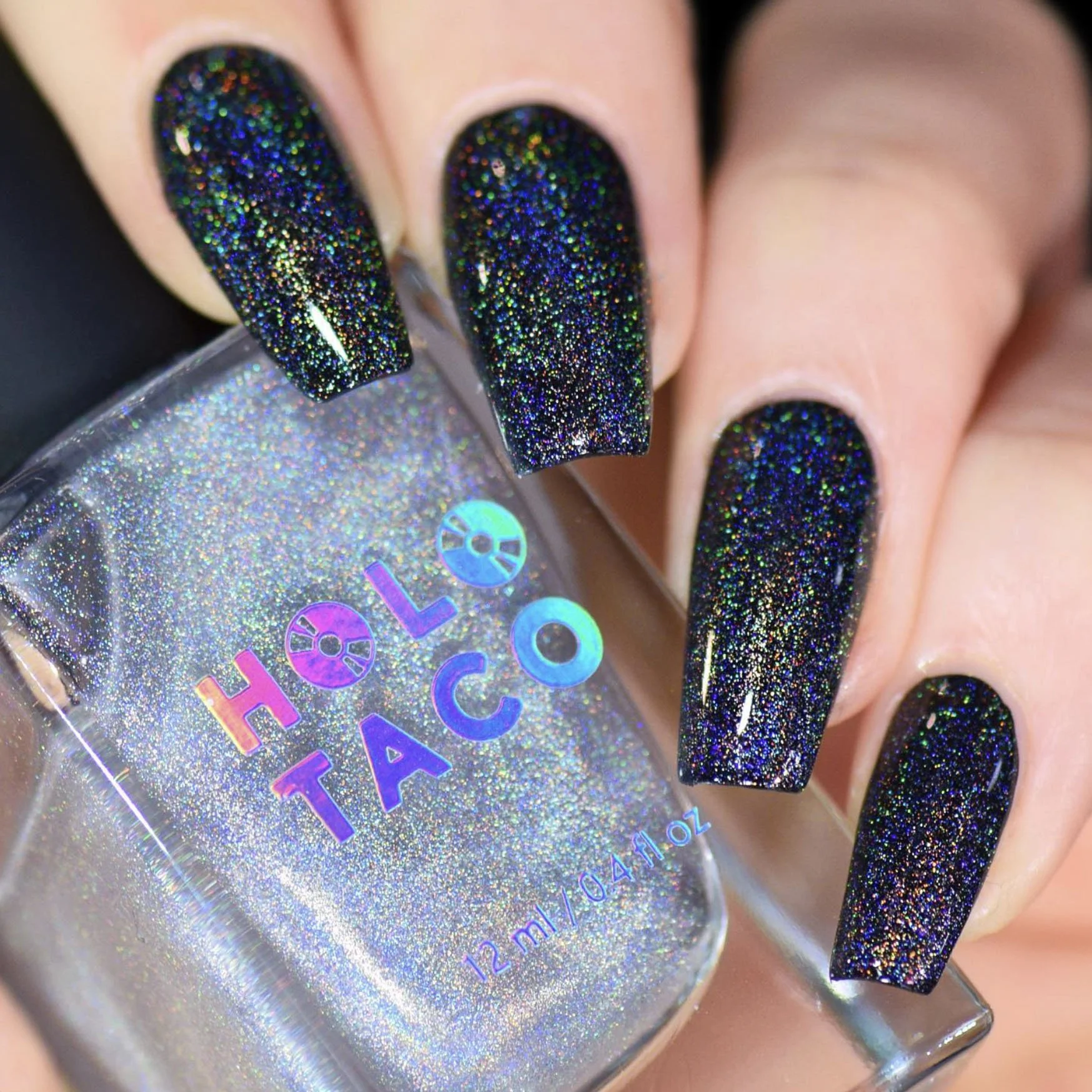
Product Photography by Holo Taco

The Branding
The name Holo Taco originates from Cristine’s YouTube tutorials, where she jokingly mispronounced “holo top coat” as “holo taco.” The phrase became a fan‑favourite inside joke and the foundation for a brand rooted in personality, humour, and community.
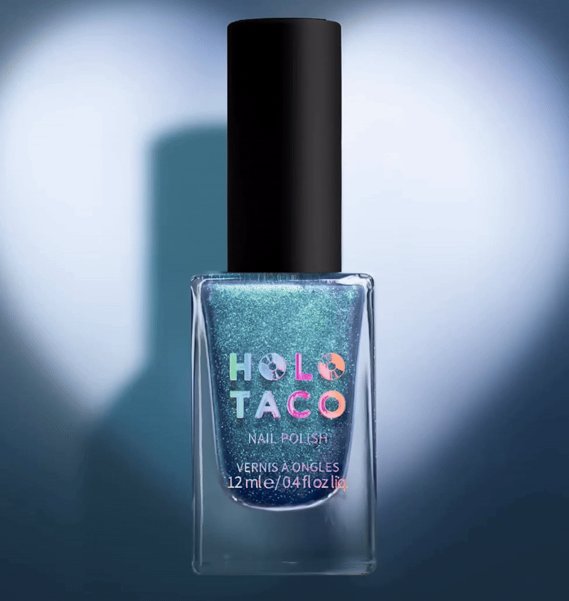
The branding process began with moodboards and extensive logo explorations. Dozens of iterations were rigorously tested and refined, narrowing down to a small set of options that best captured the essence of Holo Taco’s brand vision. The goal was to create a bold, playful identity that referenced the brand’s origin story while ensuring the logo would work seamlessly at small scales, like on nail polish bottles. The final mark celebrates the brand’s playful personality: the “holo” (holographic) element is represented by CDs, while the “taco” is depicted literally, nodding to Rotenberg’s whimsical use of these emojis on her YouTube channel.


Challenges & Strategy
The primary challenge was translating Holo Taco’s energetic, over‑the‑top personality into a streamlined mobile‑first e‑commerce experience built on Shopify. The site needed to support rapid traffic spikes, limited‑edition product drops, and high conversion expectations without overwhelming users.
To address this, the site’s information architecture and navigation were carefully structured to prioritize:
Fast access to product collections and new drops
Clear filtering and product discovery
Effortless & intuitive checkout flows
Strategic UI elements, such as countdown timers and featured limited-edition modules, were introduced to build anticipation, reinforce urgency, and drive repeat visits.


UI/UX Design
The UI balances bold, gradient‑rich colour palettes with clean layouts, playful motion/animation, and custom iconography (including a Holo Taco-themed navigation set in place of a regular mouse). Interactions were designed to guide attention, create delight, and support conversion without sacrificing usability.
Filtering and search functionality were informed by feedback from Cristine’s highly engaged online community, allowing users to quickly find specific shades, finishes, or collections. Subtle hover effects, animations, and micro‑interactions reinforce the brand’s playful personality while maintaining clarity and speed.
Every interaction was intentionally crafted to support sales while keeping the experience memorable, intuitive, and distinctly Holo Taco.


Pattern Library & Design System
A flexible, reusable design system was created to maintain visual consistency across the site while enabling rapid growth. Modular components, such as product cards & grids, CTA modules, and collection features, allow the site to scale efficiently with frequent launches and expanding inventory.
This system supports ongoing updates while ensuring the brand remains cohesive across all digital touchpoints.
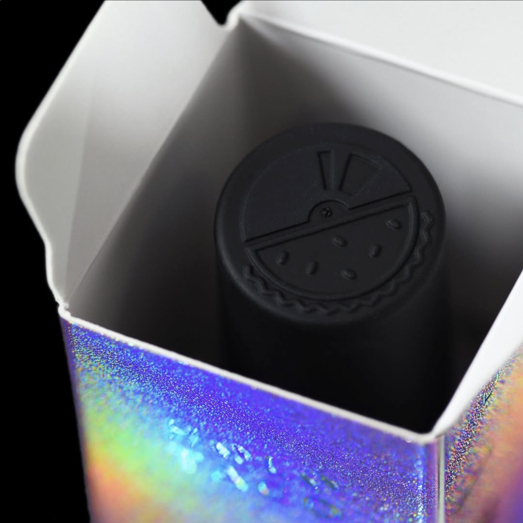
Packaging & Collateral
Packaging and print collateral were designed to translate Holo Taco’s bold, playful identity into a cohesive physical experience, creating strong shelf presence while reinforcing what makes the brand feel so distinct and meaningful to Cristine’s loyal Simply Nailogical community.
Limited-edition collection boxes were crafted as beautiful, high-end keepsakes, thoughtfully designed to feel gift-worthy and collectible, transforming the act of opening each release into a genuine moment of awe and delight.